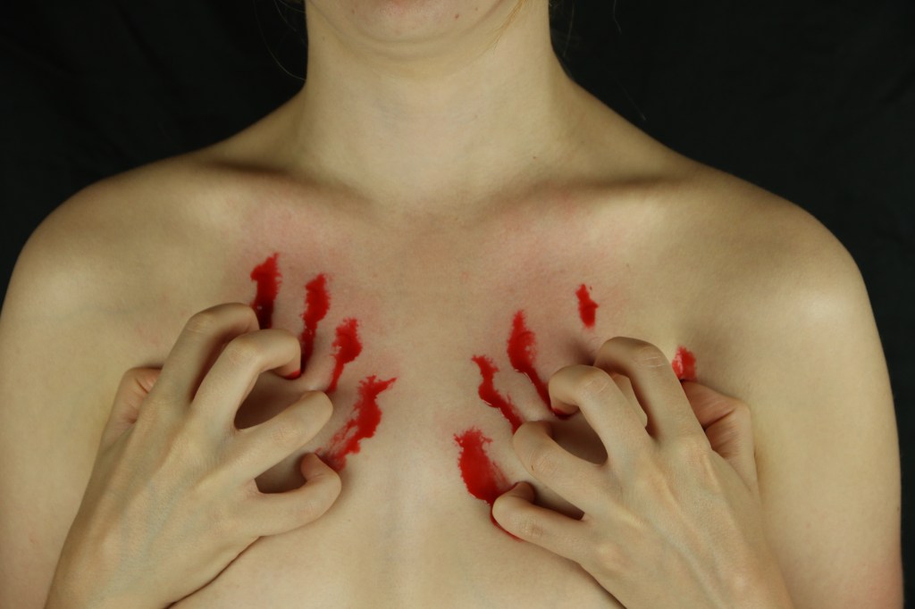
After the feedback I received on my original scratching image was that it did not look aggressive enough, I decided to add blood to make it look more realistic.
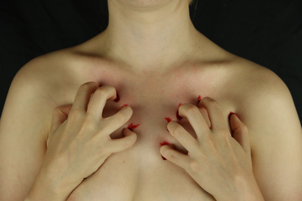
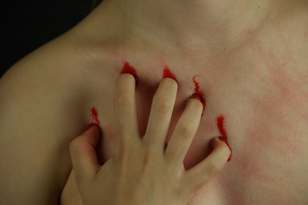
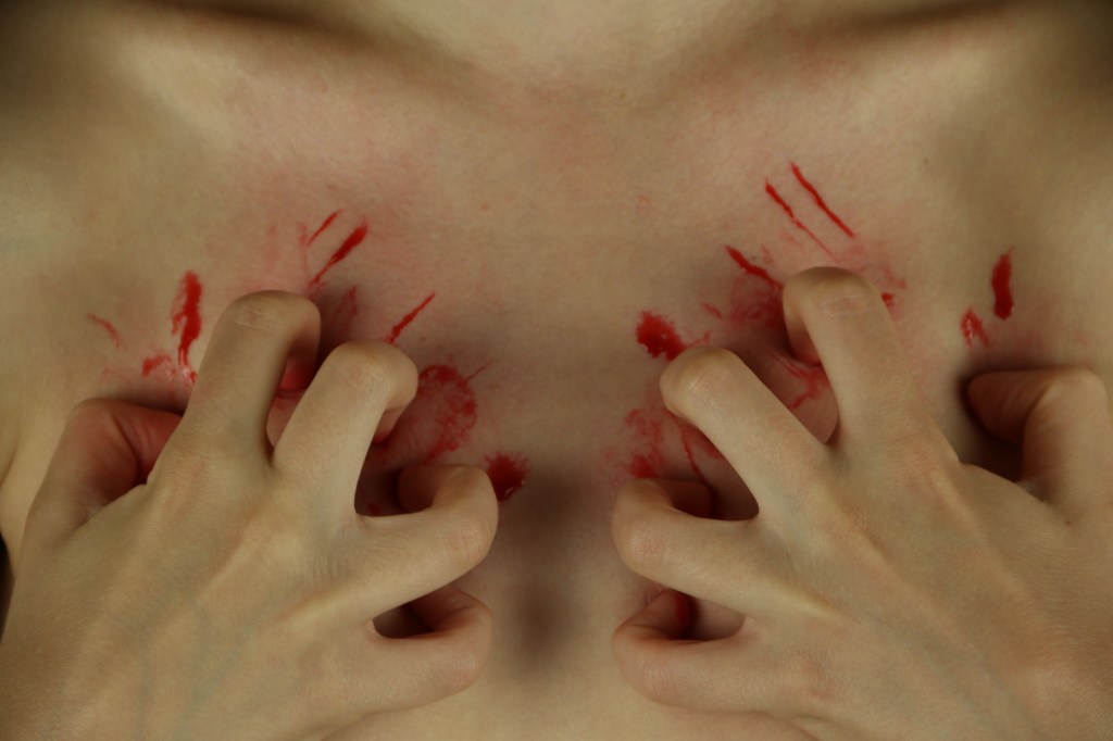
I experimented with adding quite a bit of blood within the first image that I have shown above, however felt that it looked to much and therefore looked fake. I then stripped it back more with the next two images, however this created the opposite problem in that it didn’t look strong enough. The last photos resulted in me experimenting with a messier kind of look, where I spread the blood around more. What I created from this was little lines of blood that looked more like scratches than any of the other images so continued to experiment with creating these.
I also experimented with close up shots, like the third image above, in which just one side of the body is being shown. However, I felt that this enabled the blood to look fake and wanted to recreate the first image as closely as possible.
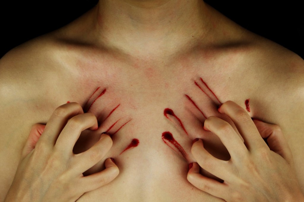
This was the final image I decided to go with. For me it was the perfect combination between appearing aggressive without going over the top with the blood. The lines look more like realistic scratches than any other image and the small holes remind me of bullet holes. This is the image I will use within my book for this concept.
