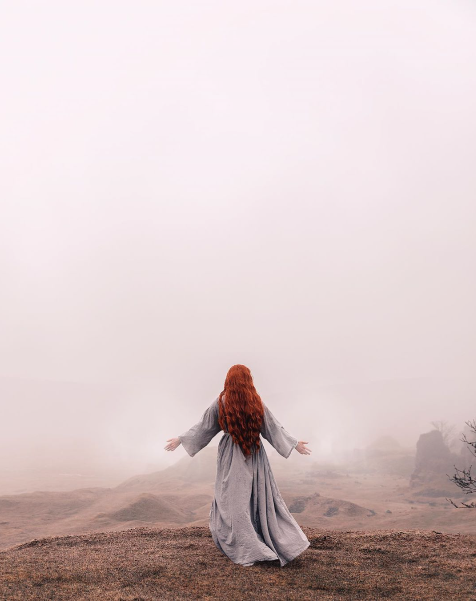
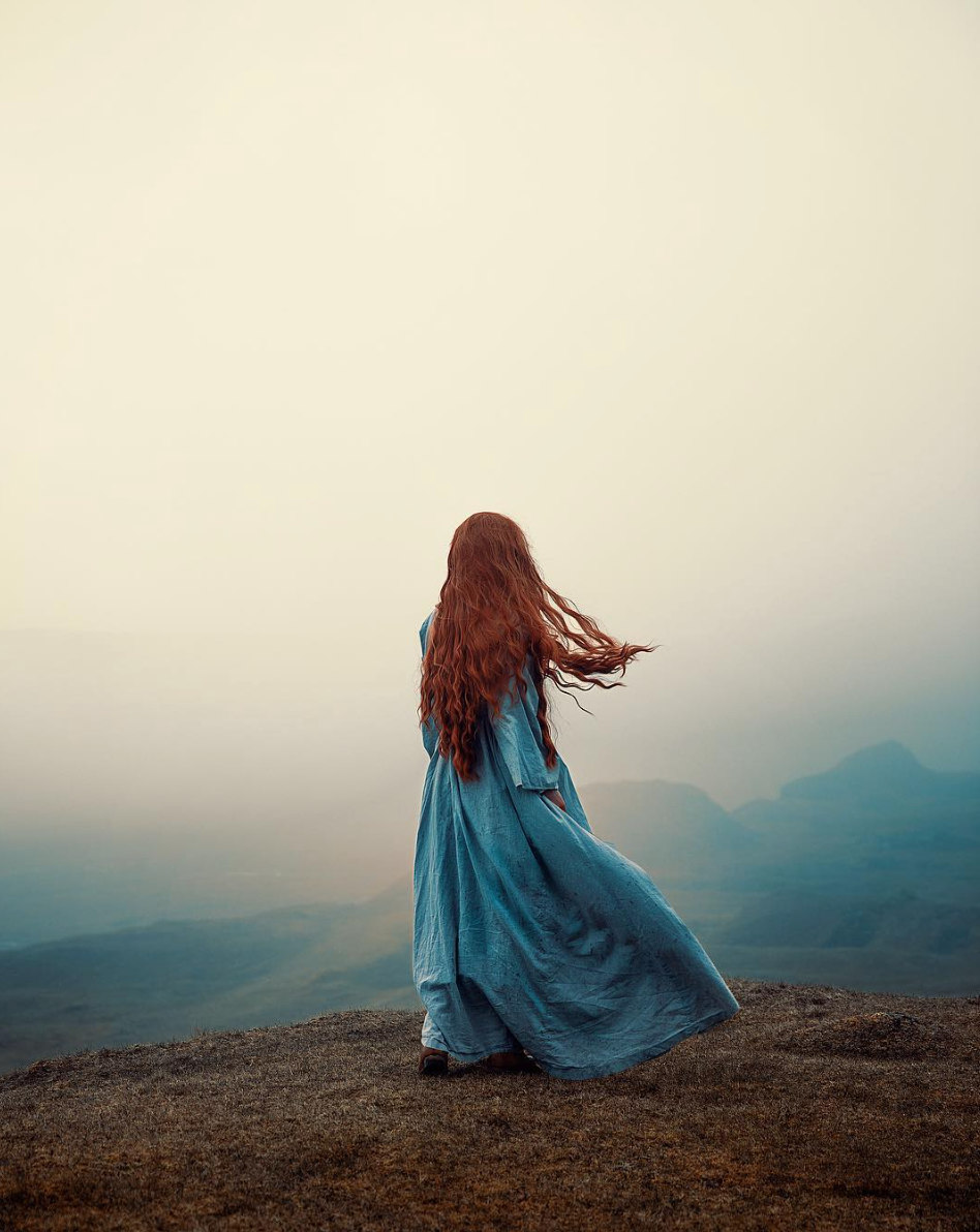
Unlike Kirsty Mitchell and Brooke Shaden, Rekha Garton’s work is simplistic, yet still manages to portray emotion in a similar way.
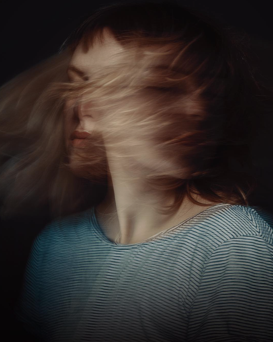
The muted colour palette used throughout her work gives the photographs a relatable feel. Unlike the bright tones used within Kirsty Mitchell’s which gives the work a editorial ‘set up’ feel, the colours here portray a calming scenario. The landscapes have clearly been carefully chosen. Not only do they continue with the calming aesthetic, the clothing has been chosen to blend into the background, creating a feeling of harmony.
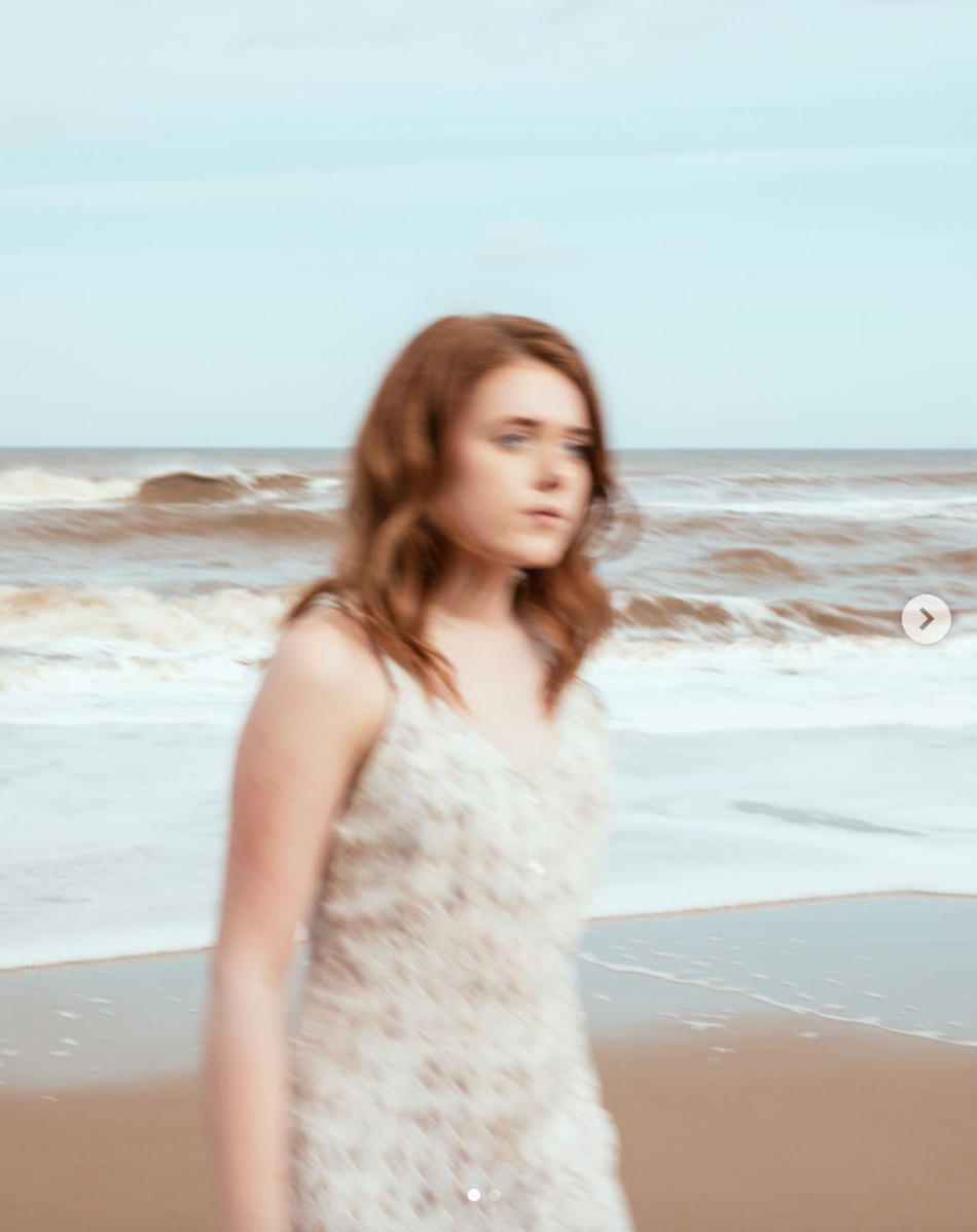
Traditional photography expectations have been challenged within the work, for example – the girl is out of focus in the bottom left photo, with the background being in focus. It not only adds a sense of movement, but means the subject becomes absorbed and one with the landscape.
I feel that the work is less fashion based, unlike Kirsty Mitchell’s and the simplistic tones within the work means there is less distraction. I want my photography to continue in this direction, remembering the message I want to portray throughout the module.
