Evaluation

Comparing this module to my last hand in, I am much happier with the result. I feel that the work has come together and the way I am presenting it works well with the concept.

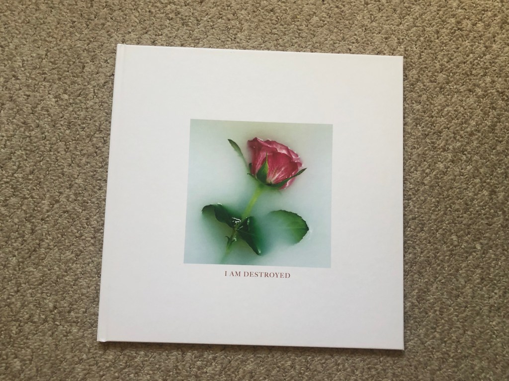
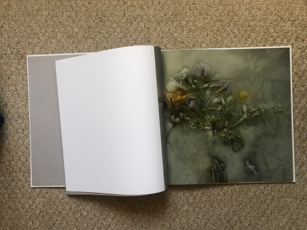
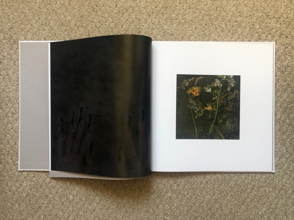
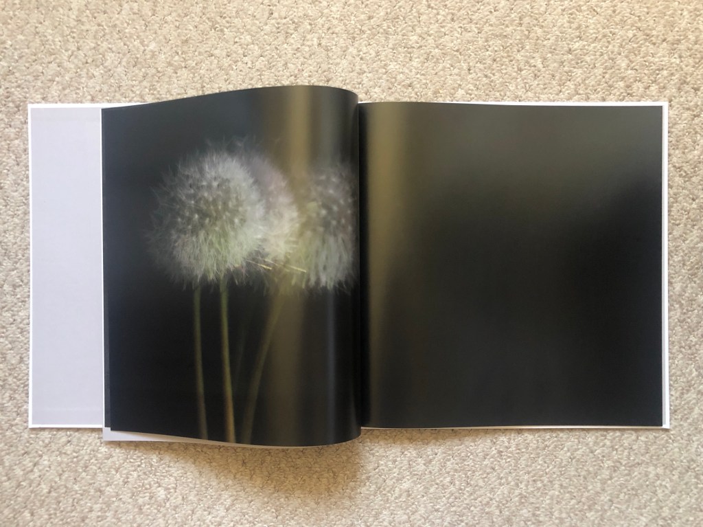
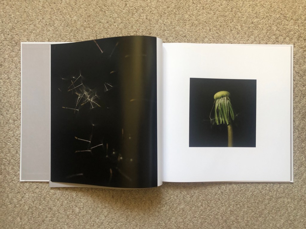
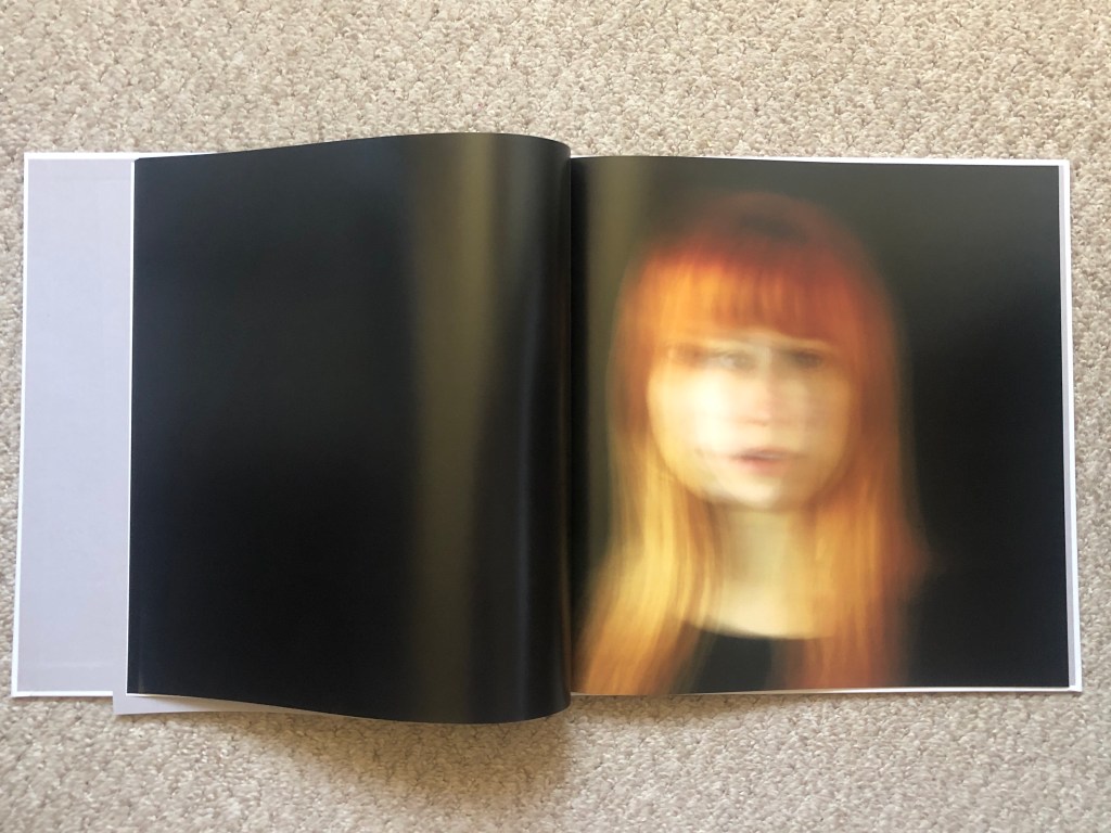
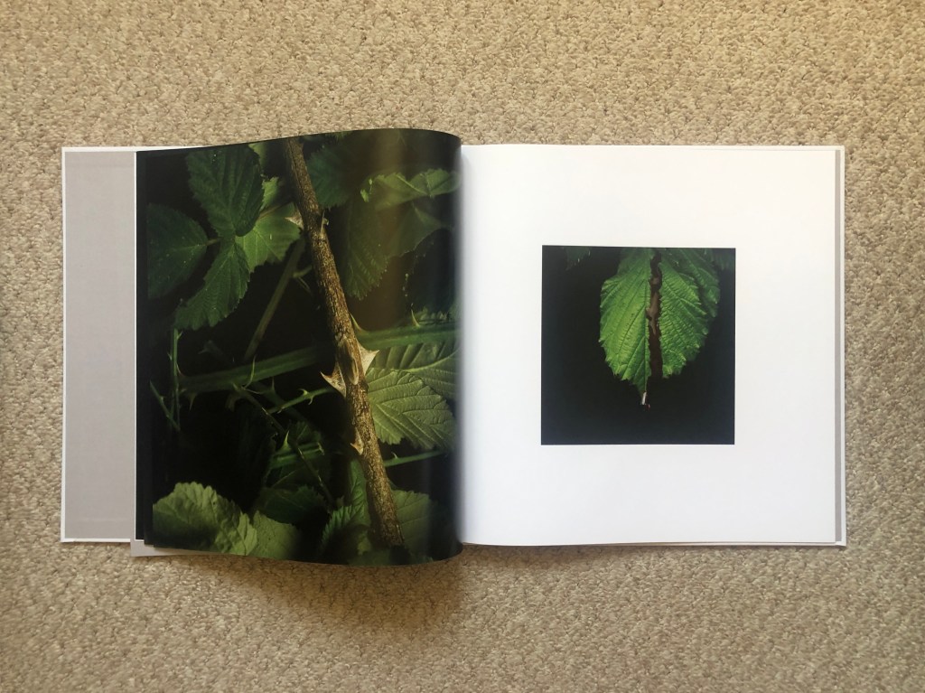
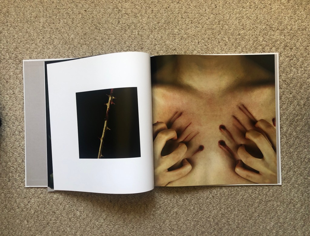
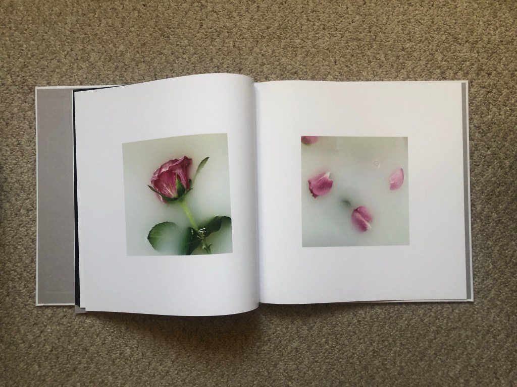
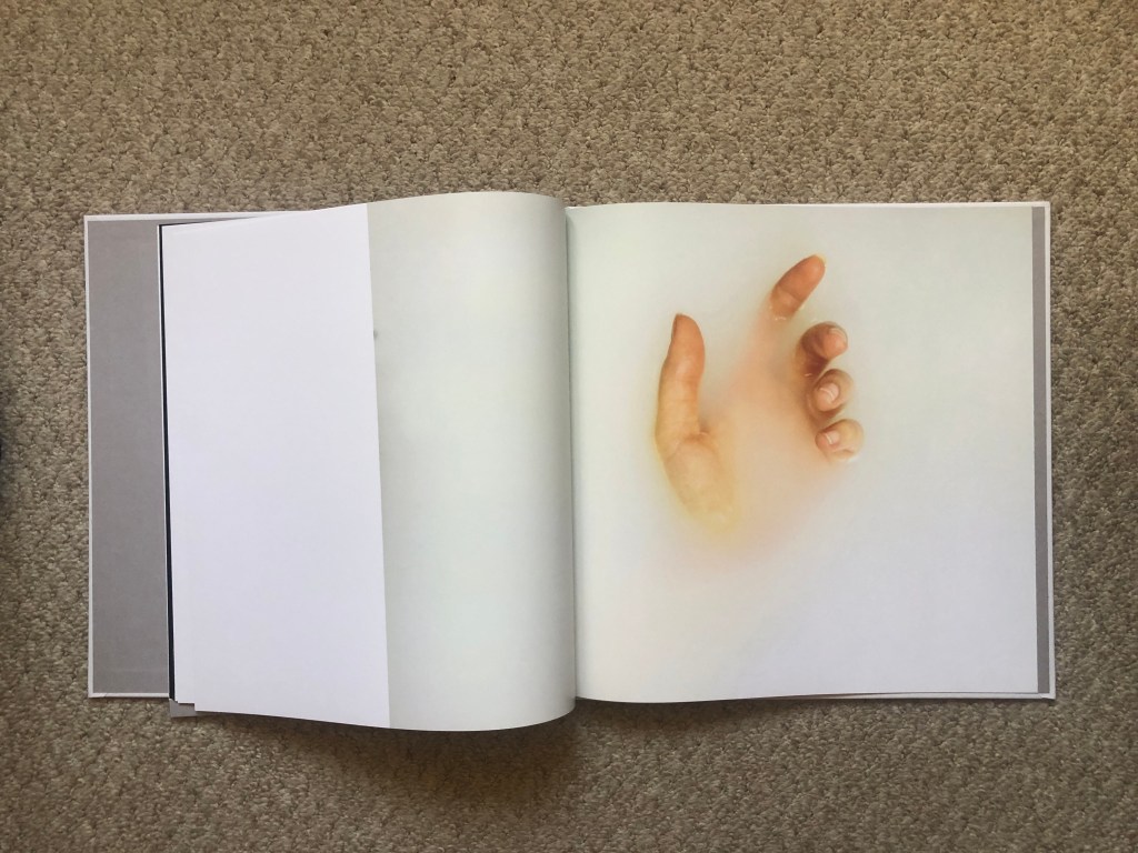
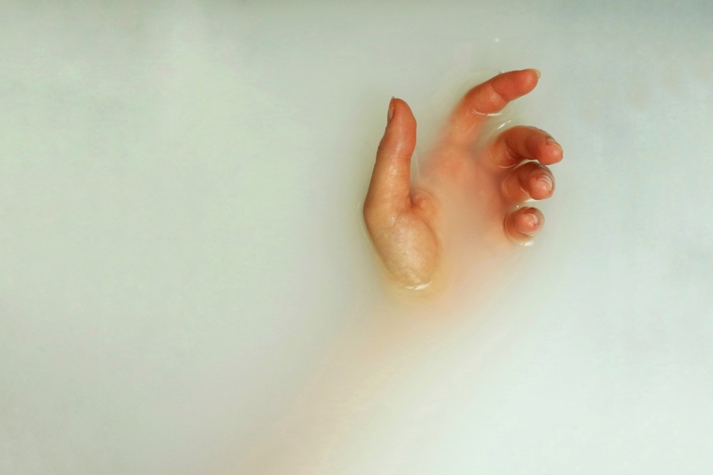
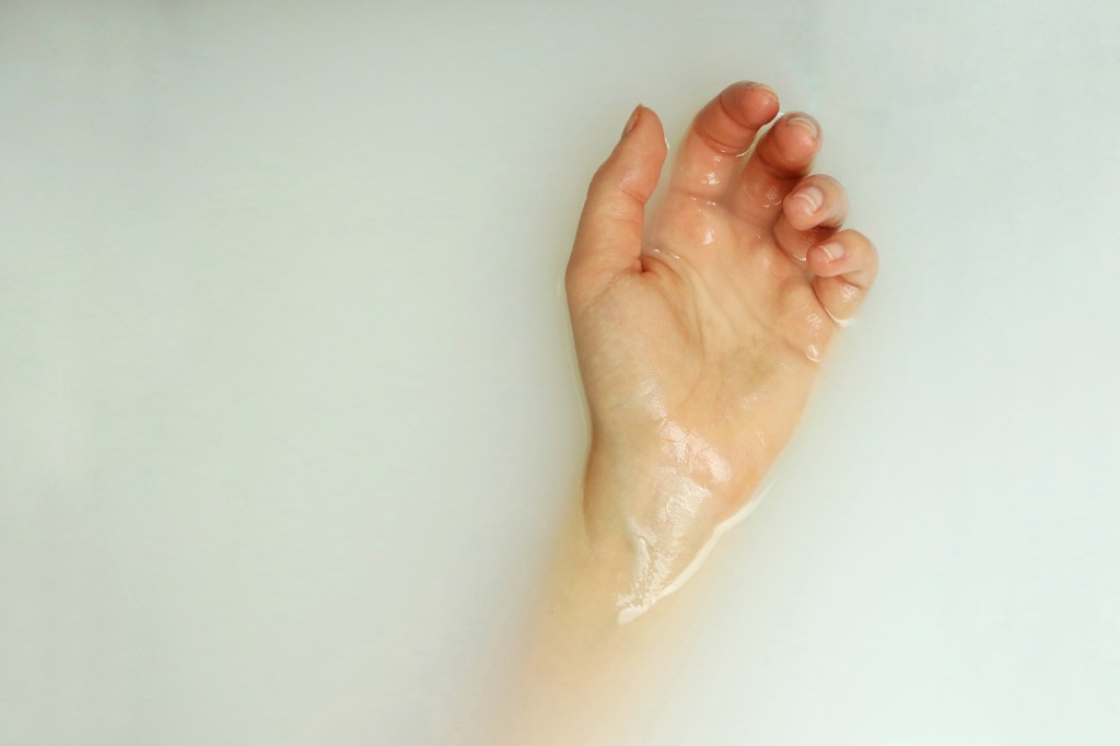
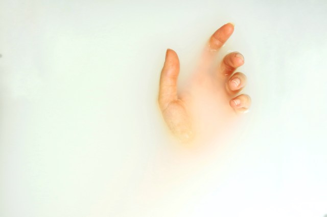
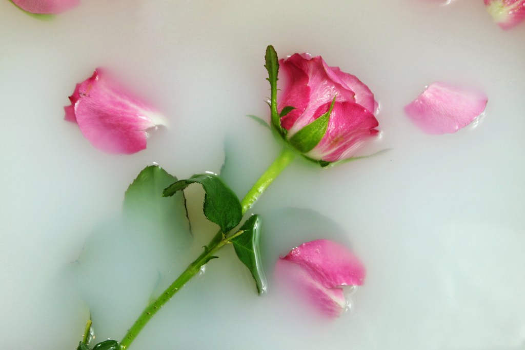
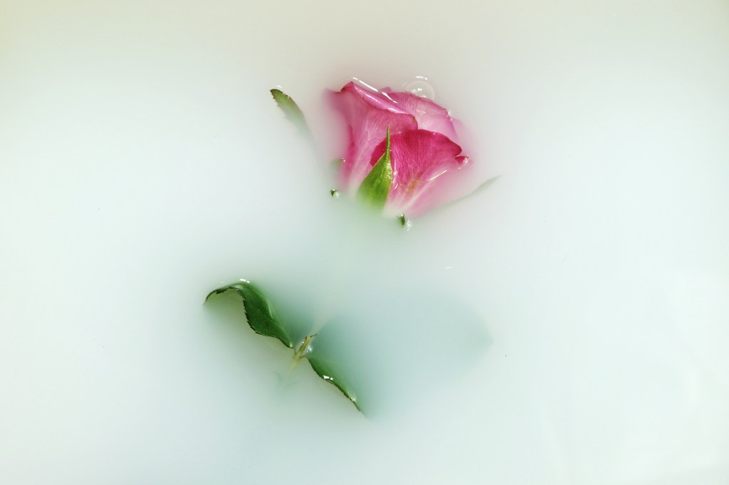
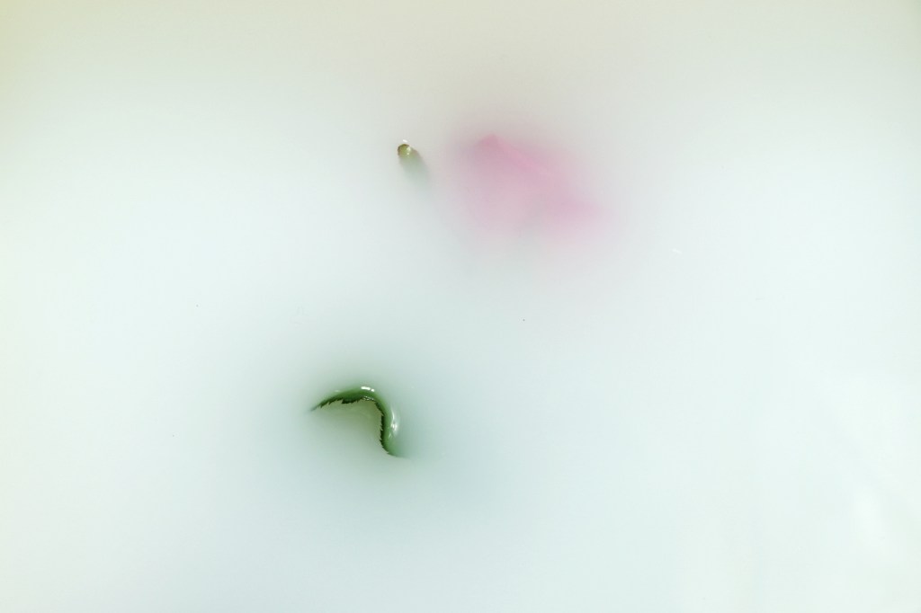
Putting the work into a book worked well for me as it gave it a much more personal feel than just large prints. The issue of mental health is such a personal issue that I want the book to feel like a private insight into the subject which I think I succeeded in doing. Having a large square book enabled the photos to be viewed in detail, which was important to me especially regarding the nature images as the detail makes up the narrative.

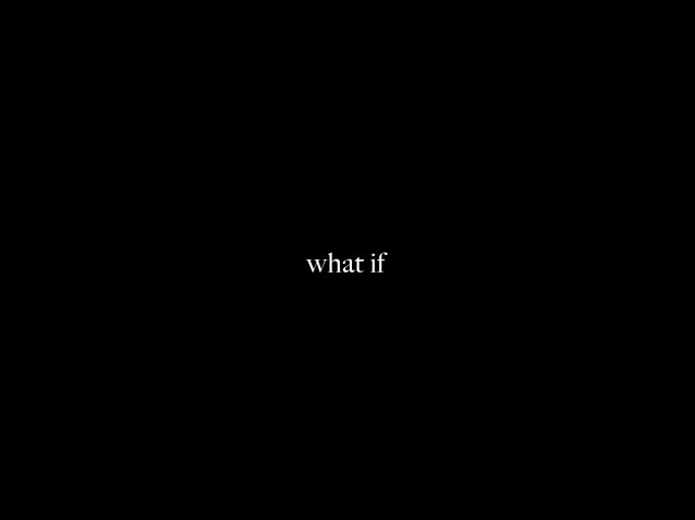
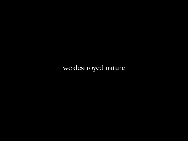
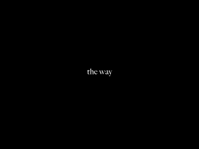
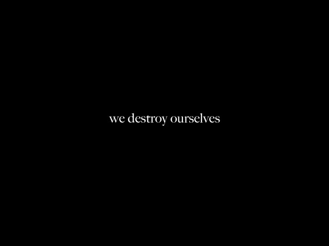
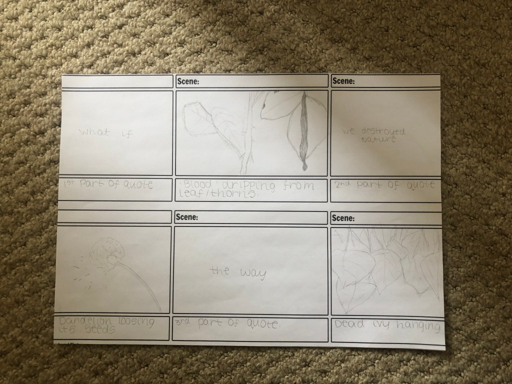
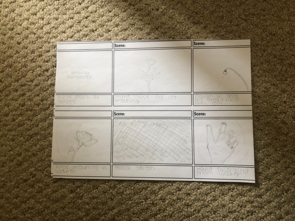
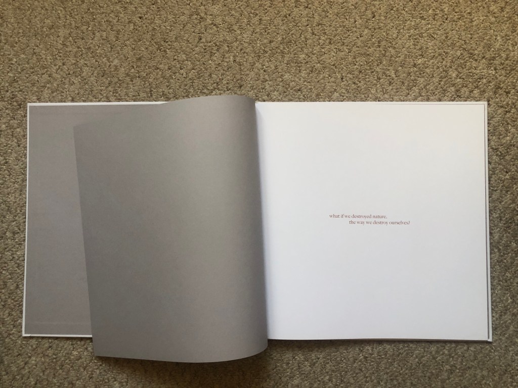
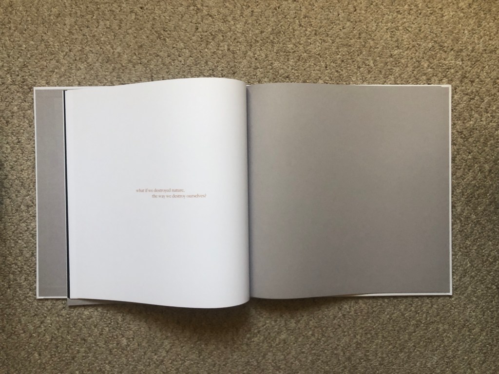
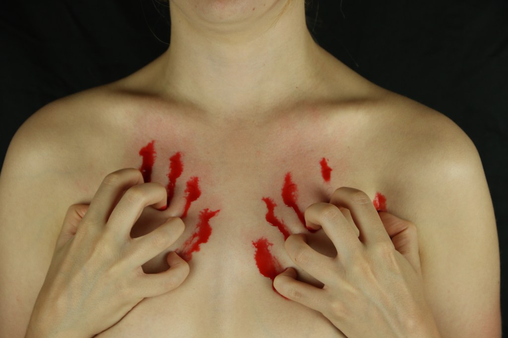
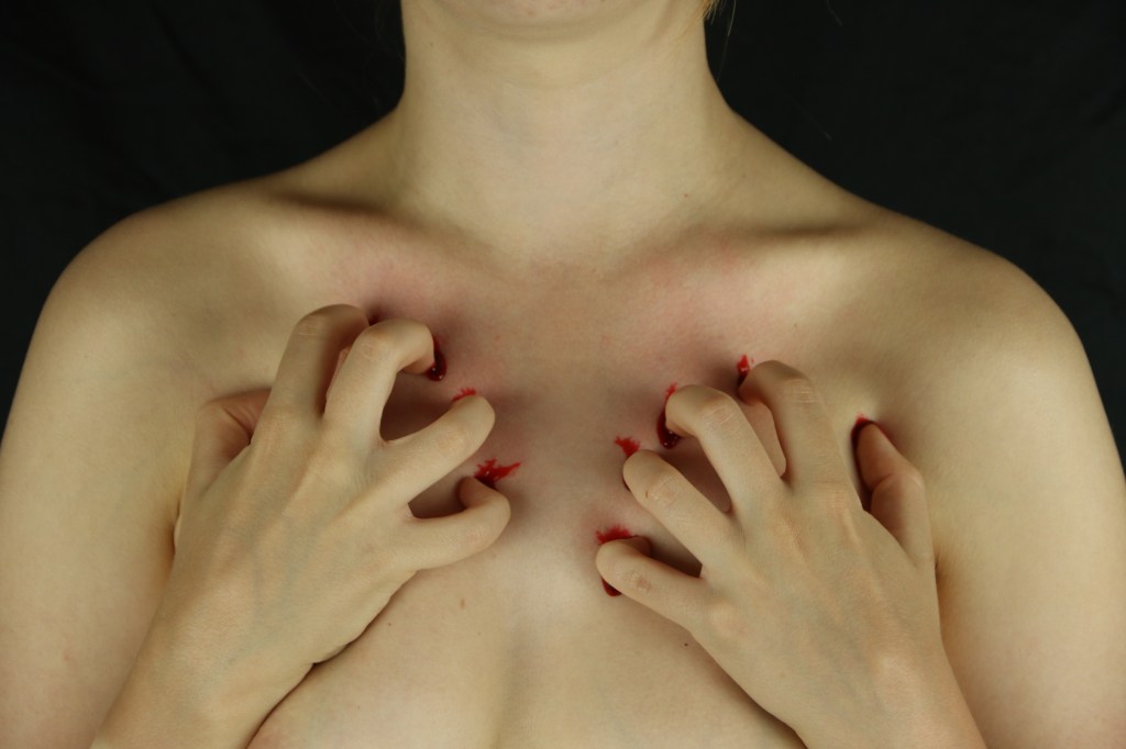
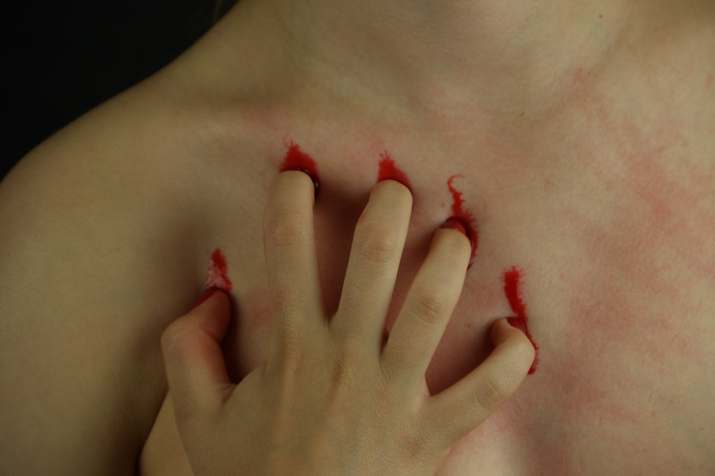
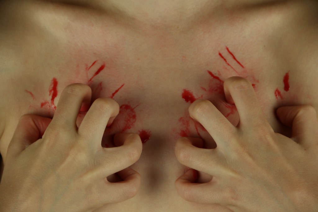
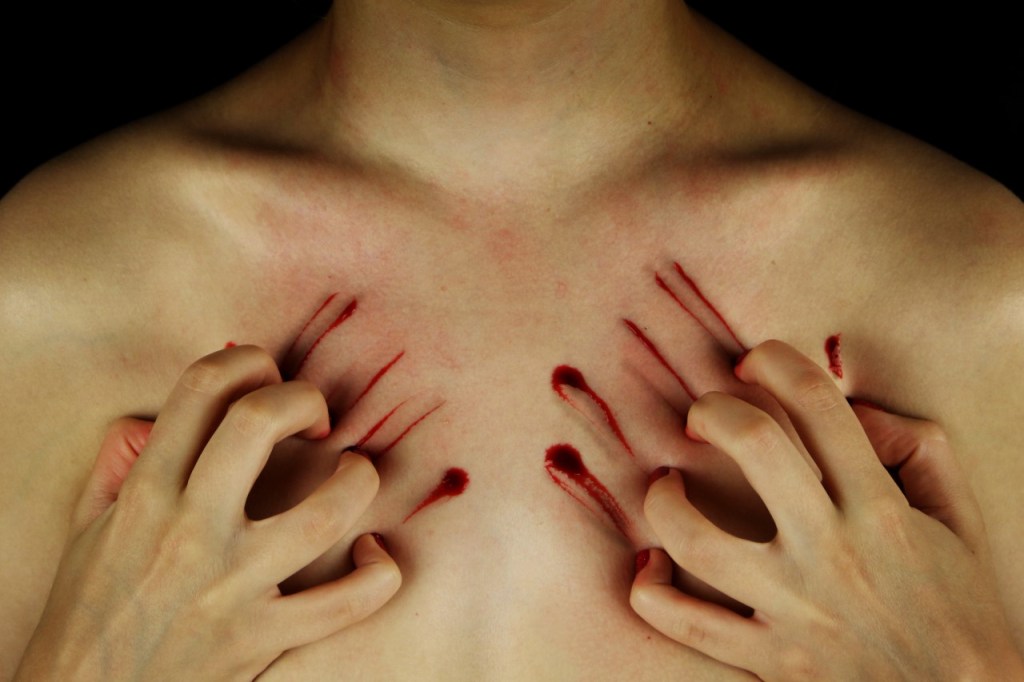
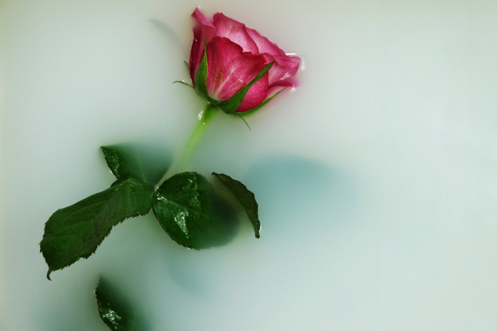
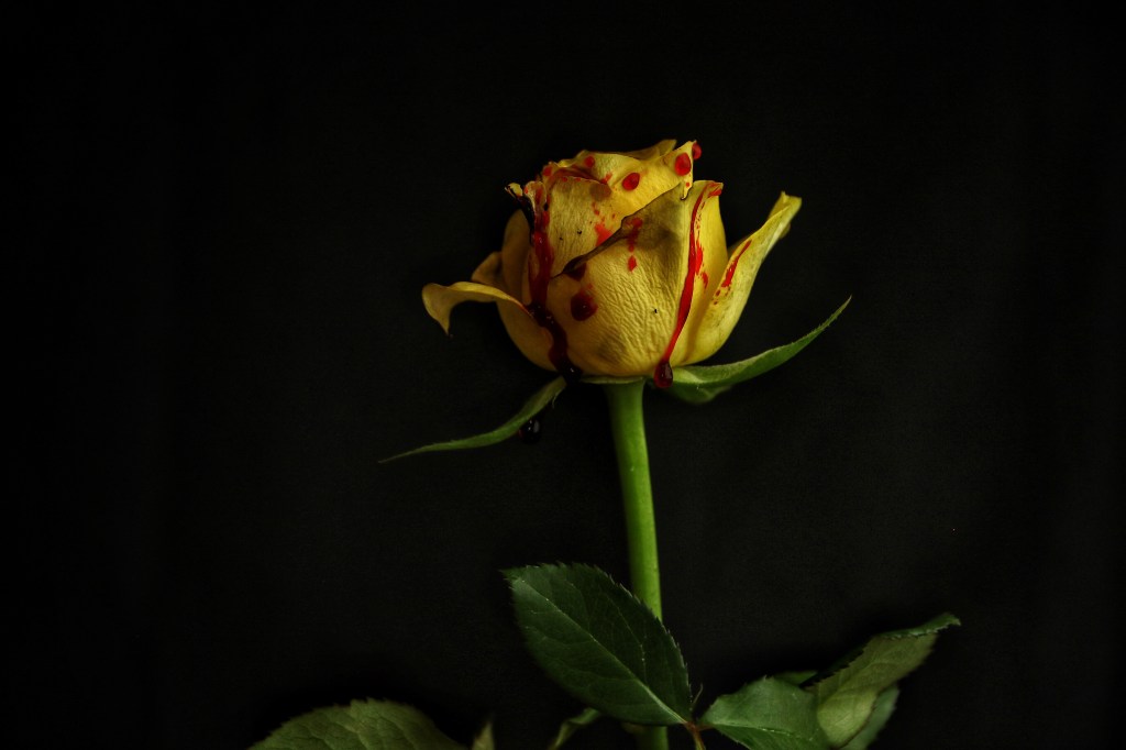
I feel that the project worked a lot better this time round as the work had a lot stronger concept then previously. After coming up with the quote ‘what if we destroy nature the way destroy ourselves’ I felt that the project started to come together and I could find a connection between the nature and self portraits which I lacked to do so in the previous hand in.

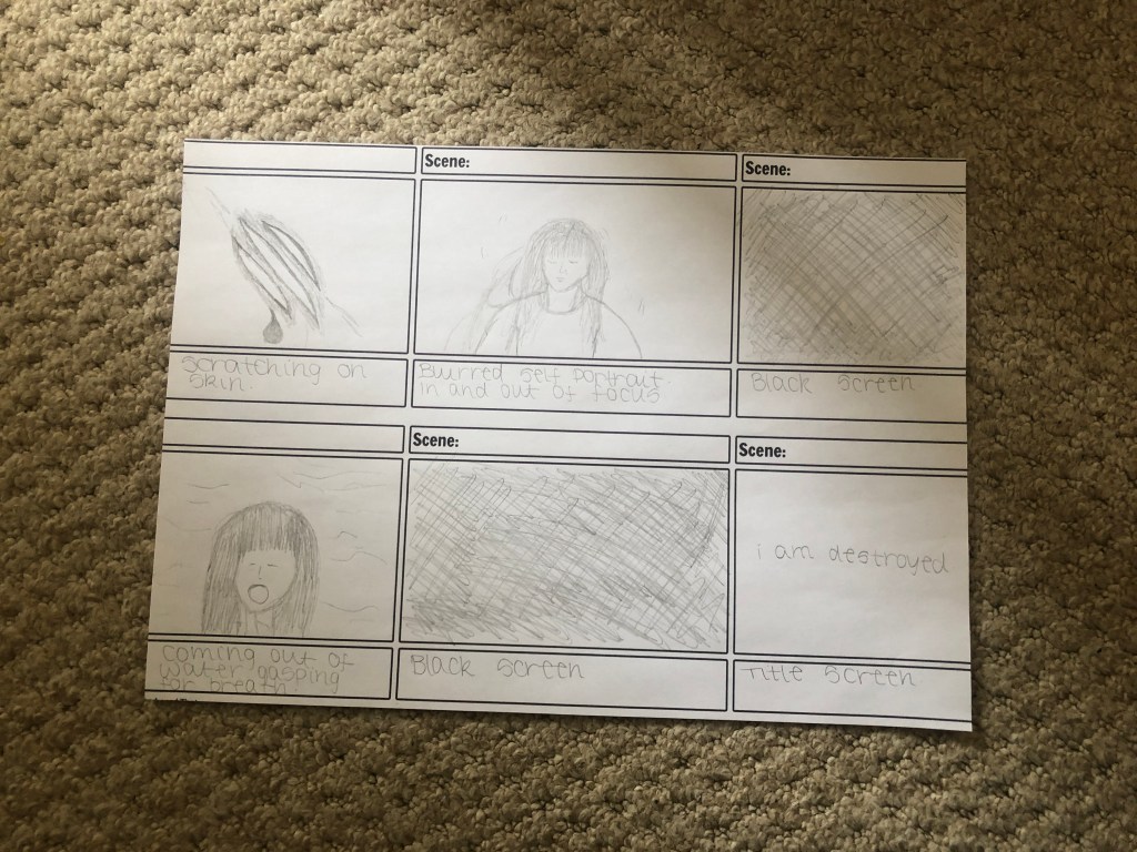
The fact the video wasn’t so much of focal point this time round, in my opinion, make it a lot stronger. Instead of focusing on the length of the video, I ensured that the content was strong, even if this meant that the video was a lot shorter. I didn’t want it to distract from the book, instead act as a trailer for it, giving the viewer an insight into what is in the book. I do feel that I could have experimented more with different parts of the video, especially the self portraiture section as I didn’t end up using all of the self portraiture videos that I shot. However, I felt that they weren’t as strong as the others and didn’t want to weaken the overall concept by inserting weak clips. I fell that the concept can still be understand from what I included, especially when paired with the book.

Overall I was happy with how the project worked out. I adapted to the Covid-19 situation which stopped me shooting outside, and therefore created a concept which would work within my house. Choosing a book to present the work was the strongest part of the project for me. Not only does it bring together the work in a much more professional way than prints, but I was happy with the way it turned out in terms of the print. After doing this project I have realised that video is something that doesn’t particularly appeal to me, yet I am pleased with my final video as I believe it links strongly to the book and portrays my concept well. I have learnt how to use and understand Premier Pro a lot more than I did before, and this is something that I want to continue to develop on and it’s an important skill to have.

Final Video

Song: Keaton Henson (ft. Ren Ford) – Field

This is my final video that I have produced for the module. The song used is Keaton Henson – Fields.

The video is around 1 minuets 40 seconds which I feel is the perfect length. It isn’t to repetitive or boring like the previous video, yet is long enough to create a narrative that links strongly to the main part of the hand in, which is the book.

Video – Test Clips

I used a simple black and white theme for the quote, linking with the black studio setting that I have used for the both the photos and video clips. The text appears fairly small, giving the impression of being isolated and alone – all feelings linked to mental illness.

I experimented with blood dripping down both a rose and leaves. I’ve decided to use the leaves as I feel the colours work better. The yellow and red create quite a contrast and although I like the idea of using a rose, there are other ideas I have for using a rose. The green against the black background, and then the deep red tones of the blood work well together for me, as well as the plant consuming the frame.

I decided to use two different clips of the dandelions within the video, which I haven’t done for any of the other clips. I feel that seeing the dandelion with and then without its seeds adds more of a narrative, and gives more of an interesting dynamic to the video by going back to the same topic. It also strengthens the idea of something getting destroyed which links to the quote used within the video.

Video Storyboard

Now that I have completed my book, I am going to focus on the video part of my hand in.

In my first hand in of this module, I feel I focused to much on the video and because of this the photos became an after thought. I was aiming to make the video around 5 minuets long and because of this filled it with content that wasn’t strong and weakened the overall concept.

With the module this time around, I want the book to be the main focus and the video to almost act as trailer for the book. I aim for it be around 1 minute long, so that I can focus on quality rather than quantity.

The video will focus use the quote ‘what if we destroy nature the way we destroy ourselves’ which was a theme throughout the book. The quote will be broken up into four parts which will appear between shots on nature destroyed. These videos will range from roses which have died to a time lapse of ice melting. Towards the centre of the video the clips will move from nature to self portraiture and become slightly more positive, touching on the idea of recovery. I will reverse some of the clips to represent this, for example, reversing blood dripping down my body so that no blood can be seen by the end. The storyboard above gives a basic idea of how I want the video to look.

Final Book

After photographing all the images I needed to for my project, I used blurb to create the final book. I settled on a large square as I really wanted the detail of the images to be seen I felt this would have the best impact.

I was really pleased with Blurb and the way in which the book turned out. The quality of the prints, along with the colours, were how I wanted it to turn out. I feel there is a continuous theme throughout the book that represents mental health, without being to obvious and allows the viewer to create their own view on the work.

Scratching – Test Images

After the feedback I received on my original scratching image was that it did not look aggressive enough, I decided to add blood to make it look more realistic.

I experimented with adding quite a bit of blood within the first image that I have shown above, however felt that it looked to much and therefore looked fake. I then stripped it back more with the next two images, however this created the opposite problem in that it didn’t look strong enough. The last photos resulted in me experimenting with a messier kind of look, where I spread the blood around more. What I created from this was little lines of blood that looked more like scratches than any of the other images so continued to experiment with creating these.

I also experimented with close up shots, like the third image above, in which just one side of the body is being shown. However, I felt that this enabled the blood to look fake and wanted to recreate the first image as closely as possible.

This was the final image I decided to go with. For me it was the perfect combination between appearing aggressive without going over the top with the blood. The lines look more like realistic scratches than any other image and the small holes remind me of bullet holes. This is the image I will use within my book for this concept.

Drowning – Test Images

After producing the rose images submerged in water, I produced a self portrait image to go in the series. Where a lot of the others self portrait images I will be putting into the book show my face, I wanted to produce one that wasn’t so obvious. Showing simply a hand, gives the impression of drowning without literally showing the whole body submerged.

The first two images appear a little dark for me and I feel that the position of the hand doesn’t work as well as the third image. For this reason I will be using the third image within the book.

Rose in Water – Test Images

Although I experimented with roses and using the ‘blood’ in a similar way to the thorns, I felt the concept worked better with the thorns. I was left, however, still wanting to use the roses so experimenting with submerging them in water.

I wanted each photograph in the seres to submerge to rose more as it went on, so I photographed the whole rose on its on slowly being pushed into the water. Although I feel that this concept works, that last image doesn’t work for me. The complete emptiness contrasts to much against the other images and makes the whole series feel empty as if something is lacking.

I then added petals around the rose itself so that this feeling of emptiness that was felt from the first idea had gone. However, this ended up being the worst of images for me as they feel overcomplicated. I also felt the rose on its on in the first idea implied the idea of being lonely which links to mental health, yet this one if anything appears to ‘pretty’ and gives totally the wrong impression.

I found the rose petals too much so removed them for the final idea. For me idea three works best as it gets rid of the issue from idea one, where there third picture looked empty compared to the rest. I do however feel that the pictures look sightly receptive and feel that having all three of the images two much .

I decided to use only two images in then as I felt that using all three was a little obvious and not needed. I also decided to mix a photos from series 3 with another from series 2. Being able to see the full rose within the first picture and then just the petals in the final image means that the series does not look to repetitive, however gives the same result of it ‘drowning’.

Test Video – Rose

As part of my video I want to put together clips that link the photos within the book. For this video clips I focused on the drip of the ‘blood’.

I experimented with reversing the video as well, and although I might not play it directly after the normal video, this is a concept I want to experiment with and may put it later in the video. Again the colour of the rose didn’t work for me, but if I was to use this clip in my final piece I would shoot using a more suitable colour.

Test Images – Roses

As well as photographing the thorns with ‘blood’, I also experimented with doing the same effect on the roses.

At the moment I have only experimented on the yellow rose, and although I like the concept I feel the yellow doesn’t work. It not only clashes with the red but also the green of the leaves and stem, and all becomes to much within the image. I would want to experiment again with red or pink rose so the connotations of romance are there, yet the blood adds makes it more interesting. I would also experiment with a flower that was white so the blood stands out against the purity of the white.

Design a site like this with WordPress.com
Get started